
I'd like to use a style sheet to give the header a bit more of a look and feel. In this article, we will show you how to use the layout's display components when designing the screen, and how you can adjust them by changing the style sheet.
Building a Demo Site with Headless SXA - Part 5 Changing the Header Style Sheet
Headless SXAXM CloudPublished: 2023-02-13
Change the look and feel of the menu
First of all, the menu is arranged with components provided in the standard functionality, so that only drop-down boxes are provided.

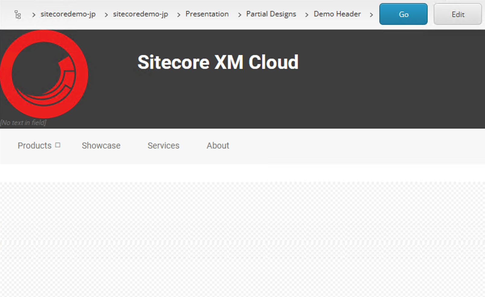
This time we will apply the Basic Site style sheet provided in the sample to this component. Check Header - Navigation horizontal as shown in the following screen shot.

When applied, the menu appears slightly shifted up.

This applied stylesheet is in the form that the definition of src\sxastarter\src\assets\basic\_navigation.scss is added. In it, you will find the following code
CSS
.navigation.navigation-horizontal {
  width: 100%;
  padding-right: 70px;
  margin-top: -15px;
We would like to control the style a bit more. For the English in the top-level menu, we will add a definition to make it all uppercase. For .navigation-title in the same file, add code to capitalize it.
CSS
> .navigation-title {
  > a {
    border-width: 0;
    font-size: $text-size-14;
    font-weight: 400;
    text-transform: uppercase;
  }
}
Add navigation for mobile devices
By modifying the style above, you can easily implement a burger menu, which takes the form of adding navigation to the rightmost portion of the third container. The procedure is as follows
- Display the container once
- Placing Navigation Components
- Set the style
- Restore the container to a non-display form.

Now you can add a menu for mobile devices. The following is how it works when actually resizing the window.

Summary
Finally, we manipulated the style sheet a little. If you are familiar with stylesheets, you will be able to understand how to change them by changing this part. Basically, this sample is based on Bootstrap 5.0, so if you are familiar with Bootstrap, you can easily change it.