
We have placed three containers and completed the top two, but have not yet implemented the third container. This is prepared for responsive design, where the menu changes according to the size of the screen. Now let's implement the third and final item.
Building a Demo Site with Headless SXA - Part 4 Creating a Partial Design - Creating Headers Part 3
Headless SXAXM CloudPublished: 2023-02-10
Container fine-tuning
First, change the settings of the container in which you are placing the logo. Set the background color to the same as the logo used in the top menu item.

Next, place the Column Splitter. The following steps will be followed for the placed components.
- Add one column (click +)
- Open settings
- Component layout Compact Phones is set to 12
- Column 1 layout Compact Phones is set to 2
- Column 1 layout Compact Phones is set to 6
- Column 1 layout Compact Phones is set to 4

As before, place the image component on the far left as the logo. Next, set up the rich text, but this time change the code a little as follows
HTML
<h1 style="color:white !important; font-size:18px; padding-top:17px;">XM Cloud</h1>We would like to place the navigation on the far right side at a later date, but for now we will leave it blank. The finished product up to this point will look like the screen below.

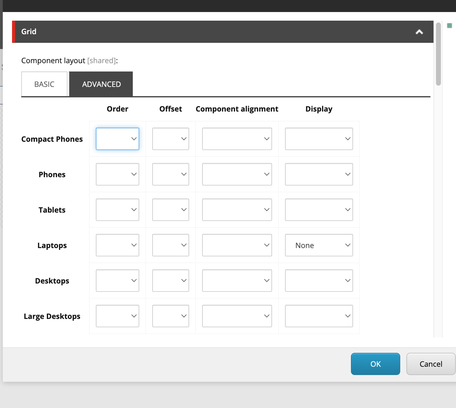
Show or hide containers
So far, we have used three containers to create the header. In fact, the first and second containers are used for normal PCs, while the third container is used for mobile devices with narrow screens.
For each container, switch to the Advanced tab of the Grid and make changes to the display.
Setting up the first container

Setting up the second container

Configure the third container
The actual work in progress is shown below.

Try resizing the screen
Once you have completed the above settings, resize the browser. You will see the settings in the container switch when it is smaller than a certain width.

This completes most of the work on the partial design header.
Summary
When first creating the header, three containers were placed because we wanted to define what to use when the screen is wide and what to use when the screen is narrow, so we prepared two to be used when the screen is wide, one to be used when the screen is narrow, and a container-based control to show and hide them according to the screen size. This makes it possible to easily specify the rendering when the screen is narrower. This is a tip that can be used not only for headers, so we first introduced it when setting the partial design of the header.