
In the last issue, we placed three containers in the header area and changed the background color with respect to two of them. This time, we would like to place the menue items in the container placed at the top.
Building a Demo Site with Headless SXA - Part 3 Creating a Partial Design - Creating a Header Part 2
Headless SXAXM CloudPublished: 2023-02-09
Use of Containers
For the top container, we will cover the container again. The reason for this will be explained in the next article. First, place the containers and make sure that they are layered as shown below. The background color and width should be set in the same way as for the container above.

On top of this container, we now place the Column Splitter component.

The following are the settings for the Column Splitter component.
- Add one Row Column
- For Component Layout, set Compact Phones to 12 in the Basic tag.
- In Column 1 layout, Basic is set to Compact Phones 6, Laptops 2, and Large Desktops 1.
- Column 2 layout Basic with Compact Phones 6, Laptops 5, Large Desktops 5
- In Column 3 layout, Basic, Compact Phones should be left blank, Laptops 5 and Large Desktops 6.
This created the logo area on the far left, the text area in the center, and the button area on the right.

Placement of various components
After splitting the image with the splitter, set the logo, text, and buttons in order from left to right. First, place the Image component in the leftmost area to display the logo.

Then, in the center container section, place a rich text component and set the following HTML.
HTML
<h1 style="color:white; padding-top:25px;">Sitecore XM Cloud</h1>
Then, in the center container section, place a rich text component and set the following HTML.
HTML
<a style="background-color: #676767;padding: 10px 35px;color: white;text-align: center;width: fit-content; float:right;"
  href="/alert">Newsletter</a>
The header area is now ready to be created.
Add content
Next, we want to create a menu, so we first create a content tree structure. In this case, we will create it as follows.
- Products
- Content Cloud
- Engagement Cloud
- Commerce Cloud
- Showcase
- Services
The About item should be at the bottom of the list of existing items. Creation and completion are expanded in the following image.

Navigation Component Placement
Before placing the navigation component, place it covered with a container as in the above procedure.

Then you can drag and drop the navigation here.

Change the settings for the situation where the menu is expanded. Select the menu and click on the second icon from the left. Here, make sure that Main Navigation - Drop down vertical is checked this time.

After completing the settings, the menu is now displayed.

Page Design Changes
The current site contains sample data and has a page design called Default. We will switch the header of this page design to the newly created header. First, select the item /sitecore/content/sitecoredemo-jp/sitecoredemo-jp/Presentation/Page Designs/Default. This item describes which partial design is to be used as the page design. Remove Header and replace it with Demo Header.

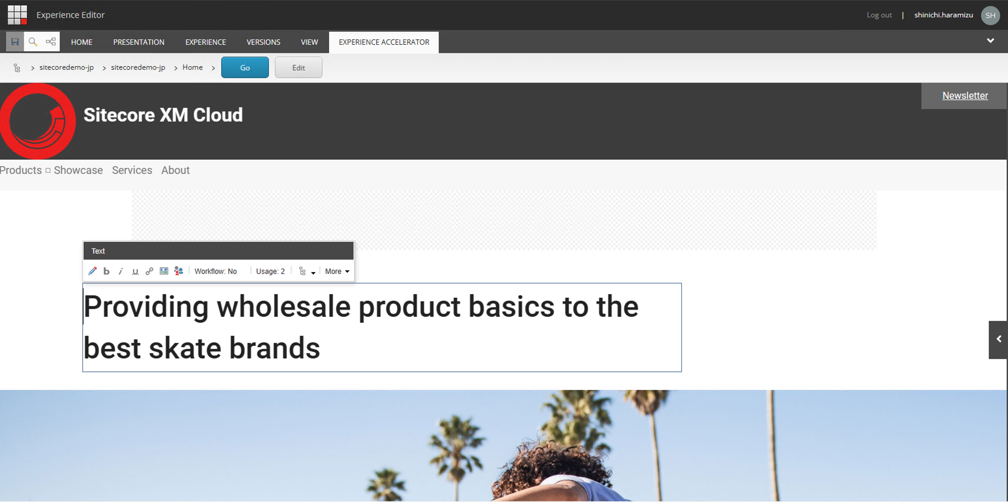
Now display the sample page. You will see that the header is switched as shown above.
Summary
This time we made some changes to the header so that we could include a section about the brand. We also added new content to reproduce the content tree in the menu. In the next issue, we will complete the header by utilizing the third container that we have not yet worked on.