
As the first step in creating a demo site, we will design a header partial. We'll use standard components with slight visual modifications. The process involves running the XM Cloud container locally as the working environment.
Building a Demo Site with Headless SXA - Part 2 Creating a Partial Design - Creating Headers Part 1
Headless SXAXM CloudPublished: 2023-02-08
Creating Headers
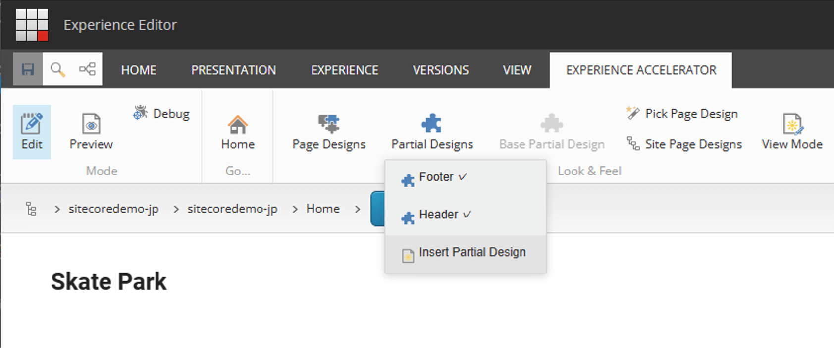
To create a partial design for use in the header area, add a partial design. To do so, first launch the Experience Editor, click on the Partial Designs item in the Experience Accelerator menu, and select Insert Partial Design to add a new design.
A dialog box will open. Here we will add a partial design called Demo Header.

The screen switches to a screen where you can place components.

Set Container
The first step is to place the containers. In this case, we will place three in the Header area.

Confirm that the three containers have been placed. This confirmation does not need to be done every time. This is just a step to show you that this is where you have changed as a blog. Open the Content Editor and find the Partial Design folder for the appropriate site.

Select this item and click on Presentation - Details in the menu to open it, select the Final Layout tab, and click on the Edit button to see where the components are placed. Clicking on the control, you can see that three containers have been placed as shown below.

Setting background color
In this case, we would like to add a background color to the container to differentiate its use. To do so, select a container and click on the second icon from the left when the screen looks like the one below.

After making your selections, change the colors in the Style section. Select Dark Background for the top container and Gray Background for the second container.

Add a style
The situation is that there is a blank space on the left side for the container placement. For this reason, we need to add a style. For example, in the standard state, there are two styles to choose from

- Centered
- Bordered
Add styles for wider widths.
- Open the content editor
- Select the tree of styles managed by the container
- Add full width to the Container style list
- Value に fullwidth-container を設定します
- Add a Container to the rendering to make this style available.

Full width can now be selected as the style. Check this.

cThe specified style is applied and the background color is applied to the full width.

Set the above style for container 2 as well.
Summary
In this article, I showed you the procedure for adding a style with three containers in a row. Although the actual work will be completed quickly, we proceeded to show you where you can see the containers when they are placed (presentation) and where you should work if you want to add a style, which is something you should know the first time around.
In the next article, we will place another component in the container to make it look more like a header.