
In the previous issue, we briefly introduced Headless SXA. Of course, the basic components are not enough to create a website. In this article, we will show you how to add display formats to existing components.
Headless SXA - Variant addition
Experience Manager (XM)Next.jsHeadless SXAXM CloudPublished: 2022-12-15
Checking Promo Components
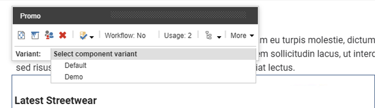
We will add a notation format to the standard component Promo. First, let's look at the current Promo, which is a combination of images and text, with the Variant set to Default.

This Promo code is scripted to be displayed by src\sxastarter\src\components\Promo.tsx. Within this code, the Default code is defined as follows
TypeScript
export const Default = (props: PromoProps): JSX.Element => {
  const id = props.params.RenderingIdentifier
  if (props.fields) {
    return (
      <div className={`component promo ${props.params.styles}`} id={id ? id : undefined}>
        <div className="component-content">
          <div className="field-promoicon">
            <JssImage field={props.fields.PromoIcon} />
          </div>
          <div className="promo-text">
            <div>
              <div className="field-promotext">
                <JssRichText field={props.fields.PromoText} />
              </div>
            </div>
            <div className="field-promolink">
              <JssLink field={props.fields.PromoLink} />
            </div>
          </div>
        </div>
      </div>
    )
  }

  return <PromoDefaultComponent {...props} />
}
Add Promo display format
This time, we will use the Default code as is, change the display position of the image, and change the function name to Demo.
TypeScript
export const Demo = (props: PromoProps): JSX.Element => {
  const id = props.params.RenderingIdentifier
  if (props.fields) {
    return (
      <div className={`component promo ${props.params.styles}`} id={id ? id : undefined}>
        <div className="component-content">
          <div className="promo-text">
            <div>
              <div className="field-promotext">
                <JssRichText field={props.fields.PromoText} />
              </div>
            </div>
            <div className="field-promolink">
              <JssLink field={props.fields.PromoLink} />
            </div>
          </div>
          <div className="field-promoicon">
            <JssImage field={props.fields.PromoIcon} />
          </div>
        </div>
      </div>
    )
  }

  return <PromoDefaultComponent {...props} />
}
Next, add a new Variant, Demo, to the Promo in Presentation - Headless Variants, which is included as a definition on the site.

When added, the Demo item will be added as shown below.
Switching to the Demo display format, you can see the shape of the image moving downward.

Summary
In this case, we only changed the display location of the images, but we were able to increase the display format of the components. And you can see from the above code that the parts that change the layout are written in HTML as usual and style sheets are applied. The component can be created as simply as possible.