
When developing with Sitecore JSS, the jss scaffold command is provided to add components. This time, we will create one component based on this command.
Creating SampleComponent
In this case, we will create a component called SampleComponent. Execute the following command at the top of the project. Note that the first letter of the component name must be capitalized.
PowerShell
jss scaffold SampleComponent

By executing this command, the following two files are created.
- /sitecore/definitions/components/SampleComponent.sitecore.ts
- Component data definition file
- Define here the items you want to edit in Sitecore
- /src/components/SampleComponent.tsx
- Defines the layout for displaying the page
The above two files are generated with the data defined as templates. The locations of the templates are as follows
- /scripts/templates
Show on page
To display the created component on the page, add the component and data to the file /data/routes/en.yml. In this case, only the heading item is set, so only a few lines of code need to be added.
YAML
placeholders:
  jss-main:
    - componentName: ContentBlock
      fields:
        heading: Welcome to Sitecore JSS
        # to author content in YAML, use _multi-line values_ (prefixed with | + endline)
        # as long as the same indent is preserved at the beginning of each line, no escaping
        # is required at all in the value, making it easy to read
        content: |
          <p>Thanks for using JSS!! Here are some resources to get you started:</p>

          <h3><a href="https://jss.sitecore.com" rel="noopener noreferrer">Documentation</a></h3>
          <p>The official JSS documentation can help you with any JSS task from getting started to advanced techniques.</p>
    - componentName: SampleComponent
      fields:
        heading: This is sample component
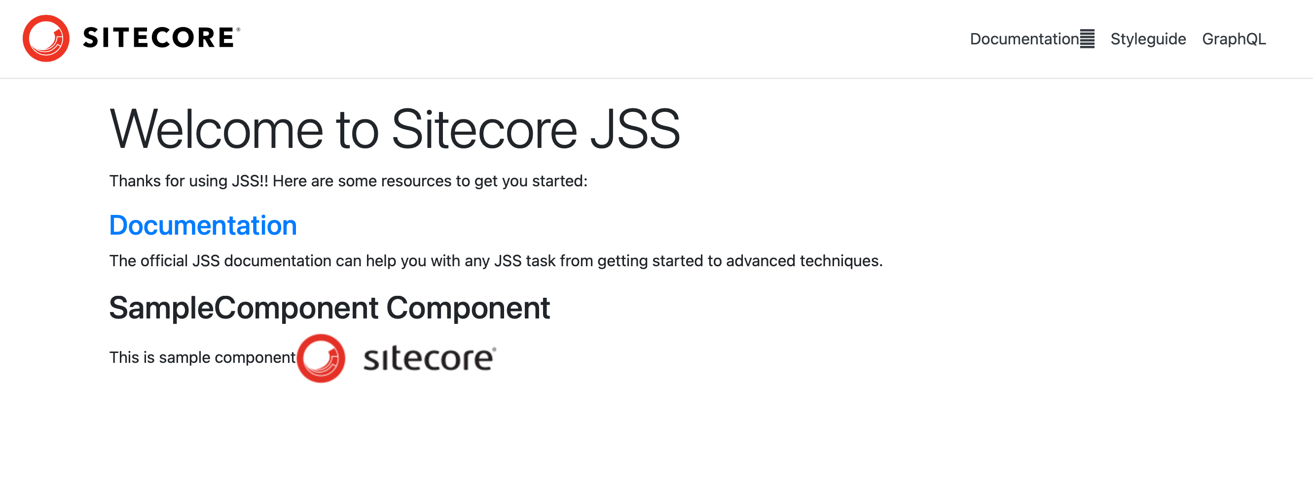
When you have finished editing, run jss start to check the page. You will see that the component you created has been added.

Components have been added.
Change components
Next, we would like to modify the component we have created. Currently, only the heading item is defined as a component, but we would like to add an image to it.
Add component item
When adding fields for content management, you will edit the following file in this case.
- /sitecore/definitions/components/SampleComponent.sitecore.ts
Items are defined as follows
TypeScript
export default function (manifest: Manifest): void {
  manifest.addComponent({
    name: 'SampleComponent',
    icon: SitecoreIcon.DocumentTag,
    fields: [{ name: 'heading', type: CommonFieldTypes.SingleLineText }],
  });
}
To add an item, add an image to the fields.
TypeScript
export default function (manifest: Manifest): void {
  manifest.addComponent({
    name: 'SampleComponent',
    icon: SitecoreIcon.DocumentTag,
    fields: [
      { name: 'heading', type: CommonFieldTypes.SingleLineText },
      { name: 'image', type: CommonFieldTypes.Image },
    ],
  });
}
Change component display
The code to change the display method would be to edit the following file
- /src/components/SampleComponent.tsx
TypeScript
import { Text, Field } from '@sitecore-jss/sitecore-jss-nextjs';
import { NextjsdemoComponentProps } from 'lib/component-props';

type SampleComponentProps = NextjsdemoComponentProps & {
  fields: {
    heading: Field<string>;
  };
};

const SampleComponent = (props: SampleComponentProps): JSX.Element => (
  <div>
    <h2>SampleComponent Component</h2>
    <Text field={props.fields.heading} />
  </div>
);

export default SampleComponent;
Add Image, ImageField to the code of the first import, this time to add an image, so that it can be used with respect to the image definition.
TypeScript
import { Text, Field, Image, ImageField } from '@sitecore-jss/sitecore-jss-nextjs';
Add image as the item definition as follows
TypeScript
type SampleComponentProps = NextjsdemoComponentProps & {
  fields: {
    heading: Field<string>;
    image: ImageField;
  };
};
Finally, add an image to the item that will be the display area. In this case, we changed the title to be displayed as h2.
TypeScript
const SampleComponent = (props: SampleComponentProps): JSX.Element => (
  <div>
    <h2>SampleComponent Component</h2>
    <Text field={props.fields.heading} />
    <Image field={props.fields.image} />
  </div>
);
This completes the component definition.
Editing Page Data
Add a description of images in /data/routes/en.yml where you have placed the component as data. For images, do not load external images, but specify them by placing them under the file /data/media/, which is located locally.
YAML
    - componentName: SampleComponent
      fields:
        heading: This is sample component
        image:
          src: /data/media/img/sc_logo.png
          alt: Sitecore Logo
After making the above changes, use jss start to display the page.
We have confirmed that we are able to resize the title of the created component and add an image.
Summary
In the Sitecore development, we have shown the steps involved in creating a component block: by using the jss scaffold command, we can see that the required files are extracted and the rest of the page is composed based on the code that has been added.