
In Sitecore, you can name layout areas using placeholders. This allows you to restrict which components can be placed in each placeholder and manage them hierarchically. In this session, we'll introduce the concept of placeholders and how to create them.
What is a placeholder?
As already mentioned in the first sentence, placeholders are used to define where components are placed. In the previous examples, we placed the component we created in a placeholder named jss-main.

For example, if you want to name the areas of your Sitecore website, the image below would be a good example. The header area and the main area would also have a banner area and a topic area.

Of course, you can also make components available for multiple areas.
Placeholder Settings
In the Next.js project, the Placeholder setting can be described as follows. The following is an introduction to the configuration items from two perspectives.
If implemented in a code-first manner
There is a configuration item called rootPlaceholders in the config file package.json. The following is sample data.
JSON
{
  "name": "sitecoredemo-jp",
  "description": "Application utilizing Sitecore JavaScript Services and Next.js",
  "version": "19.0.2",
  "private": true,
  "config": {
    "appName": "sitecoredemo-jp",
    "rootPlaceholders": [
      "jss-main"
    ],
    "sitecoreConfigPath": "/App_Config/Include/zzz",
    "graphQLEndpointPath": "/sitecore/api/graph/edge",
    "language": "en"
  },
If you wish to add a placeholder to be used at the root level, add it to this field. In addition, each placeholder can be described in sitecore/definitions/placeholders.sitecore.ts as a setting for each placeholder. The sample description is as follows (comments have been removed).
TypeScript
import { Manifest } from '@sitecore-jss/sitecore-jss-manifest';

export default function addPlaceholdersToManifest(manifest: Manifest): void {
  manifest.addPlaceholder(
    { name: 'jss-main', displayName: 'Main' },
    { name: 'jss-tabs', displayName: 'Tabs', id: 'tabs-placeholder' }
  );
}
name is the name of the item, and displayName allows the display name to be specified.
By making a description in the above file, items related to the template will be created when importing.
For Sitecore First
In Sitecore, placeholder settings are configured under /sitecore/layout/Placeholder Settings. In the component series introduced so far, an item named jss-main is created under /sitecore/layout/Placeholder Settings/Project/sitecoredemo-jp, and the associated rendering is prepared. The associated rendering is prepared.
Adding a Placeholder
From here, we will proceed with the setup in a Sitecore-first environment. When we have time, we hope to show you how to write the code in a code-first environment separately.
Layout Settings
The definition of where on the page a placeholder can be used is defined in the file layout.tsx. The following sample code is the standard implementation.
HTML
      <div className="container">
        <Placeholder name="jss-main" rendering={route} />
      </div>
Rewrite this section as follows
HTML
      <div className="container">
        <Placeholder name="jss-header" rendering={route} />
      </div>
      <div className="container">
        <Placeholder name="jss-main" rendering={route} />
      </div>
      <div className="container">
        <Placeholder name="jss-footer" rendering={route} />
      </div>
This code is reflected in the environment.
Create a placeholder in Sitecore
Create an item with the name of the placeholder under the placeholder settings in Sitecore. In this case, we have named the items Header and Footer to make the display names easier to understand. We also set up the available components.


This time we want to be able to place the simple components we have been creating. Therefore, we have reduced Main a little.

Placeholder settings available in the layout
The layout this sample uses is an item from /sitecore/layout/Layouts/Project/sitecoredemo-jp/sitecoredemo-jp Layout. Please add Header and Footer as placeholders available in this layout.

Verification
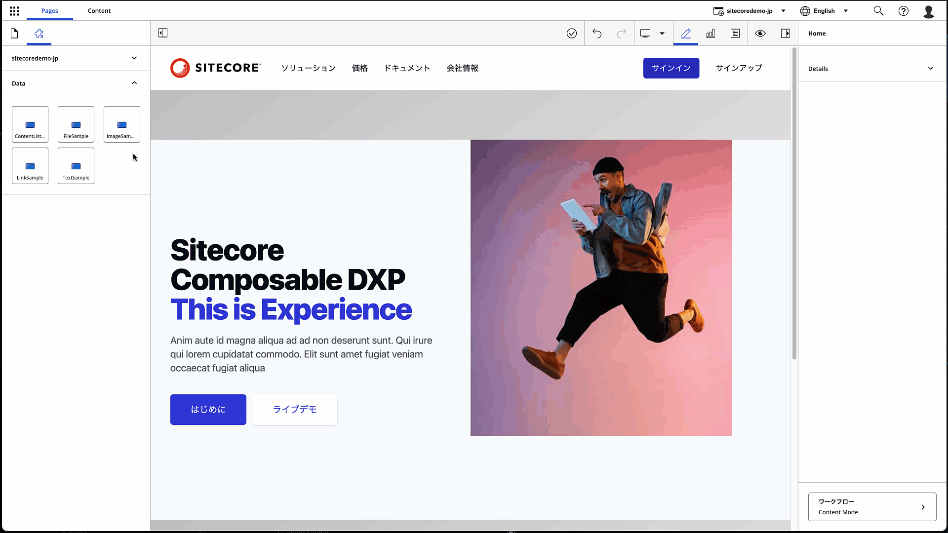
When you move to the edit screen with all the above settings completed, the header and footer areas are added as shown below.


The components available for the header area are specified as follows
If you specify a component that is not available, it will be marked with an icon that says it cannot be placed. You can also place a text component and specify an item to place the component. See the animated image below.
The procedure for adding placeholders and the movement of placing tied controls was verified.
Summary
When creating the wireframes for a page, we set up areas, and by setting placeholders for the names of each area and deciding which components can be placed there, we can create a consistent design for the site. In this article, we have introduced placeholders, a useful feature for determining page design.