
This time, we'll create a component using a content list. A content list is useful for specifying multiple Sitecore items and utilizing their data collectively. Common use cases include selecting keywords for Meta tags, among other needs.
Creating Content List Components
In this case, we will create a component that sets up one field that can manage data for the content list.
Component Creation
First, prepare two Data/ContentListSample definition files by executing the following code.
PowerShell
jss scaffold Data/ContentListSample
This will create the following two files
- sitecore/definitions/components/Data/ContentListSample.sitecore.ts
- src/components/Data/ContentListSample.tsx
The first file allows you to define the types of fields that make up the template. In this case, we will add code to the following file: contentlist1 is created and the content type is CommonFieldTypes.ContentList.
TypeScript
export default function ContentListSample(manifest: Manifest): void {
  manifest.addComponent({
    name: 'ContentListSample',
    icon: SitecoreIcon.DocumentTag,
    fields: [{ name: 'contentlist1', type: CommonFieldTypes.ContentList }],
  });
}
The code responsible for rendering is as follows, differing from the standard code in that the `Item` entry has been added to the import.
TypeScript
import { Text, Item, Field, withDatasourceCheck } from '@sitecore-jss/sitecore-jss-nextjs';
import { StyleguideComponentProps } from 'lib/component-props';

type ContentListSampleProps = StyleguideComponentProps & {
  fields: {
    contentlist1: Item[];
  };
};

const ContentListSample = (props: ContentListSampleProps): JSX.Element => {
  const { contentlist1 } = props.fields;

  return (
    <div>
      <h2>Content List</h2>
      <div>
        {contentlist1 &&
          contentlist1.map((listItem, index) => (
            <div key={`contentlist-${index}`}>
              {/* The referenced item's fields can be rendered and edited using normal helper components: */}
              <p>
                Page Title: <Text field={listItem.fields.pageTitle as Field<string>} />
              </p>
            </div>
          ))}
      </div>
    </div>
  );
};

export default withDatasourceCheck()<ContentListSampleProps>(ContentListSample);
Creation of templates in Sitecore, creation of folders for data storage
First, create a template that will define the component. Select the field name contentlist1 and the field format treelist.

Then create a folder for data storage.

After creating the sample item, the sitecore content tree will be displayed. In this case, select the item /sitecore/content/sitecoredemo-jp/Home to be displayed on the right side.

Add renderings, set placeholders
Then add rendering. Add a new Json Rendering under the path /sitecore/layout/Renderings/Project/sitecoredemo-jp/Data. Specify ContentListSample as the rendering name. Set the following two items in the settings of the rendering you created.
- Data source location: pre-created folder
- Data source template: a pre-created template
The settings are as follows

Add the rendering you have created to the placeholder.

Verification
Once the component was actually placed, the sample data could be displayed as shown below.

This time, the Text tag is used, so the text can be changed.

If you make changes to the data you have changed in the content editor, you will see that you have made the correct changes.

We have also included a section regarding the overview. So we will rewrite the layout slightly so that this section can be additionally displayed.
TypeScript
const ContentListSample = (props: ContentListSampleProps): JSX.Element => {
  const { contentlist1 } = props.fields;

  return (
    <div>
      <h2>Content list</h2>
      <div>
        {contentlist1 &&
          contentlist1.map((listItem, index) => (
            <div key={`contentlist-${index}`}>
              {/* The referenced item's fields can be rendered and edited using normal helper components: */}
              <h3>
                Title: <Text field={listItem.fields.pageTitle as Field<string>} />
              </h3>
              <p>
                Content: <Text field={listItem.fields.PageDescription as Field<string>} />
              </p>
            </div>
          ))}
      </div>
    </div>
  );
};
After making the change, the summary can also be displayed as shown below.

Finally, another Home item is created and added to the content list as well. The screen shot after creating the item is as follows

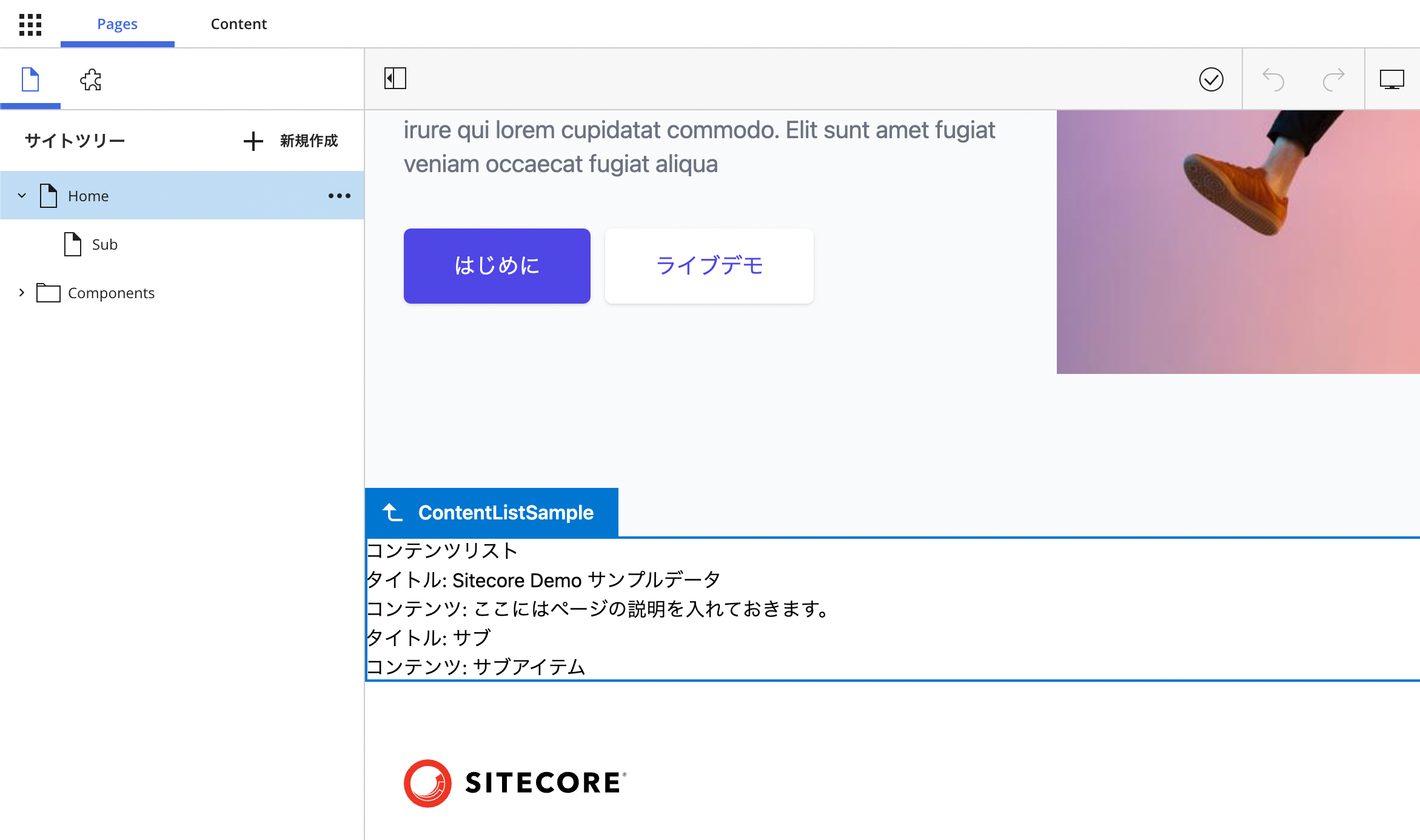
We now have a situation where two items are specified. So what does the sample page look like?
Since two items are specified, the component now displays the titles and summaries of the two items.
Summary
We have created a content list component, but the field format in Sitecore is Treelist, which displays a list of content. In fact, in this case, we are only displaying the content, but it can also be used to specify recommended topics and create a list of links.