
The data formats we have introduced so far were items that are often used as general data, but this is a modest topic that introduces check boxes.
Creating a checkbox component
This time, we will create a component that can set multiple fields related to check box data, and check how to write and operate it.
Component Creation
First, prepare two Data/CheckboxSample definition files by executing the following code.
PowerShell
jss scaffold Data/CheckboxSample
This will create the following two files
- sitecore/definitions/components/Data/CheckboxSample.sitecore.ts
- src/components/Data/CheckboxSample.tsx
The first file can define the types of fields that make up the template. Add code to the following file
TypeScript
export default function CheckboxSample(manifest: Manifest): void {
  manifest.addComponent({
    name: 'CheckboxSample',
    icon: SitecoreIcon.DocumentTag,
    fields: [
      { name: 'checkbox1', type: CommonFieldTypes.Checkbox },
      { name: 'checkbox2', type: CommonFieldTypes.Checkbox },
    ],
  });
}
To check what the value of a checkbox is, the following code is used in the display.
TypeScript
import { Field, withDatasourceCheck } from '@sitecore-jss/sitecore-jss-nextjs';
import { StyleguideComponentProps } from 'lib/component-props';

type CheckboxSampleProps = StyleguideComponentProps & {
  fields: {
    checkbox1: Field<boolean>;
    checkbox2: Field<boolean>;
  };
};

const CheckboxSample = (props: CheckboxSampleProps): JSX.Element => (
  <div>
    <p>チェックボックス1</p>
    <div>
      {props.fields && props.fields.checkbox1 && props.fields.checkbox1.value && (
        <li>
          <code>チェックボックス1</code> はチェックされています
        </li>
      )}
      {!props.fields ||
        !props.fields.checkbox1 ||
        (!props.fields.checkbox1.value && (
          <li>
            <code>チェックボックス1</code> はチェックされていません
          </li>
        ))}
    </div>
    <p>チェックボックス2</p>
    <div>
      {props.fields && props.fields.checkbox2 && props.fields.checkbox2.value && (
        <li>
          <code>チェックボックス2</code> はチェックされています
        </li>
      )}
      {!props.fields ||
        !props.fields.checkbox2 ||
        (!props.fields.checkbox2.value && (
          <li>
            <code>チェックボックス2</code> はチェックされていません
          </li>
        ))}
    </div>
  </div>
);

export default withDatasourceCheck()<CheckboxSampleProps>(CheckboxSample);
Create a template in Sitecore
Create a template in Sitecore. In this case, we will provide two checkbox fields.

Creation of folders for data storage
Create a folder called CheckboxSample under the already created Components/Data folder. Then, create a sample item under that folder. When creating the item, it is necessary to specify a template, which is the template created in the previous step.

Set up the sample data, but this time, check box 1 is unchecked and check box 2 is checked.

Add renderings, set placeholders
Then add rendering. Add a new Json Rendering under the path /sitecore/layout/Renderings/Project/sitecoredemo-jp/Data. Specify CheckboxSample as the rendering name. Set the following two items among the rendering settings you created.
- Data Source Location: Pre-created folders - Folders that have been created in advance.
- Data Source Template: Pre-created templates
The settings are as follows

Add the rendering you have created to the placeholder.

Verification
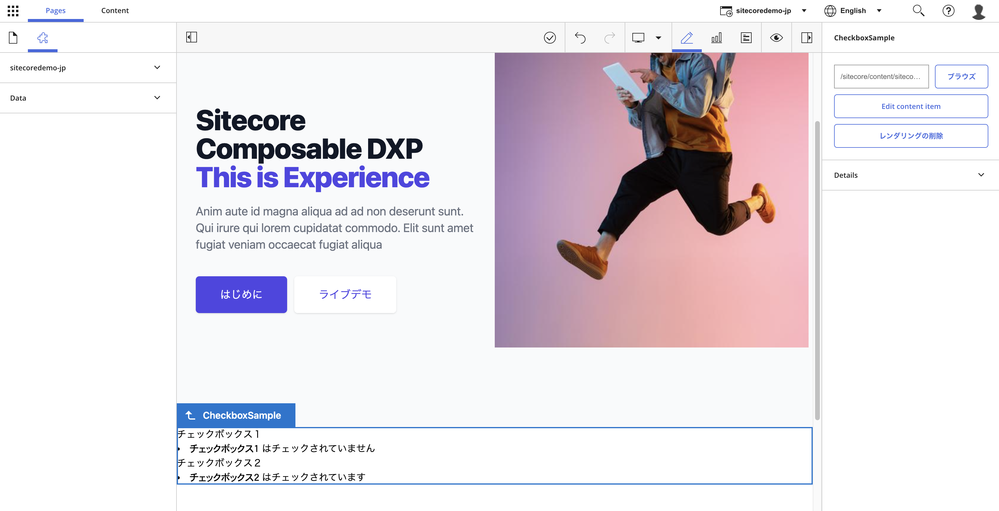
Again, the component is placed in the admin panel. The result is as follows
We were able to determine if the item's checkbox was checked or not.
Summary
A checkbox is used when an item has multiple fields, and when checked, the checkbox will process the additional fields. For example, you may want to use checkboxes to display content that is only visible when the user is logged in.