
In the previous article, we created a template using a field format related to text. This time we will create a component that allows you to specify an image.
Creating Image Components
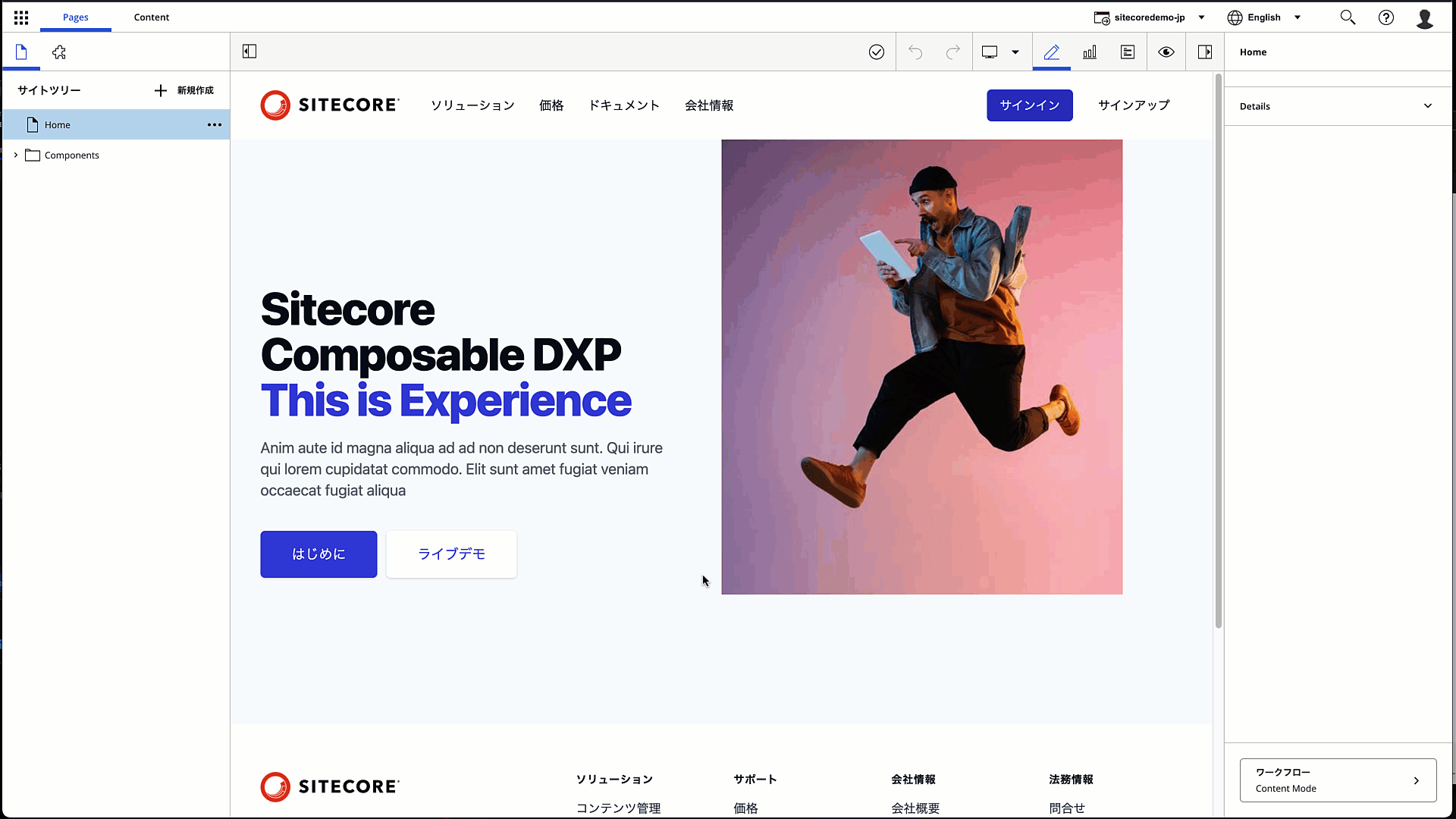
In this case, we will create an image component to display images on the page. We will not only display them, but also allow them to be edited on the page.
Component Creation
First, prepare two Data/ImageSample definition files by executing the following code.
PowerShell
jss scaffold Data/ImageSample
This will create two files
- sitecore/definitions/components/Data/ImageSample.sitecore.ts
- src/components/Data/ImageSample.tsx
The first file can define the types of fields that make up the template. Add code to the following file
TypeScript
export default function ImageSample(manifest: Manifest): void {
  manifest.addComponent({
    name: 'ImageSample',
    icon: SitecoreIcon.DocumentTag,
    fields: [{ name: 'image1', type: CommonFieldTypes.Image }],
  });
}
Then edit the following file, which is a layout file, to display this item as an item on the page: ImageField is added to import, and you can see that we are trying to display data using the Image tag.
TypeScript
import { ImageField, Image, withDatasourceCheck } from '@sitecore-jss/sitecore-jss-nextjs';
import { StyleguideComponentProps } from 'lib/component-props';

type ImageSampleProps = StyleguideComponentProps & {
  fields: {
    image1: ImageField;
  };
};

const ImageSample = (props: ImageSampleProps): JSX.Element => (
  <div>
    <p>ImageSample コンポーネント</p>
    <Image media={props.fields.image1} />
  </div>
);

export default withDatasourceCheck()<ImageSampleProps>(ImageSample);
Create a template in Sitecore
Then create a template. This time we will prepare a simple one with only one image field.

Creation of folders for data storage
Create a folder called ImageSample under the Components/Data folder of the site you created last time. Then, create a sample item under that folder. When creating the item, you will need to specify a template, which you created in the previous step.

Specify an image from Sitecore's media library to complete the item creation.

Add rendering
Then add rendering. Add a new Json Rendering under the path /sitecore/layout/Renderings/Project/sitecoredemo-jp/Data. Specify ImageSample as the rendering name.

Of the rendering settings you have created, set the following two items
- Data Source Location: Pre-created folders
- Data Source Template: Pre-created templates
The settings are as follows

Placeholder Settings
Specify the placeholder item. Again, specify the Main item. Add a control so that you can use the component you created.

Verification
I would like to place the module in the same way as before.
We now have a component that allows us to embed images in the page. For this verification, we will rewrite the code a bit more. Let's rewrite the code of the component as follows (before and after is omitted)
TypeScript
const ImageSample = (props: ImageSampleProps): JSX.Element => (
  <div>
    <p>ImageSample コンポーネント</p>
    <Image
      field={props.fields.image1}
      editable={false}
      imageParams={{ mw: 100, mh: 50 }}
      height="50"
      width="94"
    />
  </div>
);
When this code is expanded, the image is resized as shown below and is not editable. If you only want to display the image in this way, you can use the `editable` field to make it uneditable.

Is it possible to prepare images that are responsive? For this, the following description will work to prepare the resource in advance on the server side.
TypeScript
const ImageSample = (props: ImageSampleProps): JSX.Element => (
  <div>
    <p>ImageSample コンポーネント</p>
    <Image
      field={props.fields.image1}
      srcSet={[{ mw: 300 }, { mw: 100 }]}
      sizes="(min-width: 960px) 300px, 100px"
    />
  </div>
);
If you have written the above code, you will see the following HTML displayed and also provided with respect to image size.
HTML
<img
alt="Jump"
width="1100"
height="733"
sizes="(min-width: 960px) 300px, 100px"
srcset="
/-/jssmedia/sitecoredemo-jp/GettyImages-1183367089.ashx?mw=300 300w,
/-/jssmedia/sitecoredemo-jp/GettyImages-1183367089.ashx?mw=100 100w
"
src="/-/media/sitecoredemo-jp/GettyImages-1183367089.ashx?h=733&iar=0&w=1100&hash=1FD27EE38776805D782964BA955743E7"
/>Please note that responsive processing is only available for files in the media library, and Sitecore Content Hub uses a different description method.
Summary
In addition to the ability to display and edit images, we also introduced the preparation of multiple images for use in responsive and other applications. We confirmed that it is not only possible to edit images as you see them, but also to provide images that fit the size of the window.