
In the previous article, we organized the header and footer areas. In this article, we will create a new component for the Hero area to be used on the top page. Through this procedure, you will learn how to create a new component.
Create a new component
Use the jss command to create a new component.
PowerShell
jss scaffold Hero
After execution, two files are created.
- sitecore/definitions/components/Hero.sitecore.ts
- src/components/Hero.tsx
Sitecore Settings
Now that the code for the component is ready, we need to create a template on the Sitecore side. For this project, the template location is /sitecore/templates/Project/sitecoredemo-jp. Create a new template here. The name of the template is Hero and the base template is the default.
Once the item has been created, specify the heading in Data and create a one-line text, as we have not added any items yet.

Set a standard value to prepare a default value when the item is created.

Then prepare a folder where you can create common items using this template. Create a Hero folder under /sitecore/content/sitecoredemo-jp/Components.

Next, create a rendering. Add a rendering for /sitecore/layout/Renderings/Project/sitecoredemo-jp using the Json Rendering template.

The resulting item will look like this

Finally, specify that the component you created is available for the placeholder. Add Hero to the placeholder's associated controller in /sitecore/layout/Placeholder Settings/Project/sitecoredemo-jp/jss-main.

This is the end of all preparations.
Creating Sitecore Items
This time, we will delete the Home item we have been using and create a new Home item. The template to be used is /sitecore/templates/Project/sitecoredemo-jp/App Route.
The only home item created is the page title Sitecore Demo.

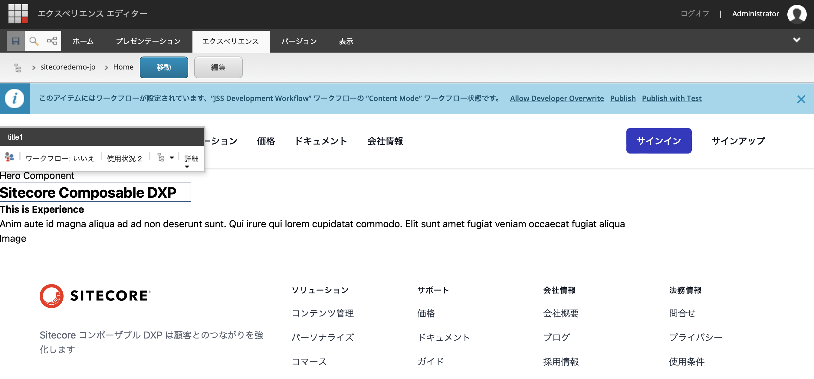
Once the item is ready, launch the Experience Editor. Since you do not have any sub-items, you see a page with only a header and footer.

Click on an empty area to add a component, and you will see that you can select the Hero component that you have just created.

Selecting Hero will bring up the item selection screen. Since nothing has been created yet, select Create New Content, name the item, and click the OK button.

The screen switches and this time an error appears. In the development environment, if you connect to the development environment at hand at this time, the error will not occur, but if not, you will see this error.

Save the file without worrying about any errors, and then return to the environment at hand.
Connect with Sitecore locally to create a layout
In the environment at hand, what does it look like when you run jss start and connect to Sitecore? The following screen is accessed from localhost.

You can see that the work you just edited in the Experience Editor is reflected when you update the contents of the item /sitecore/content/sitecoredemo-jp/Components/Hero/HomeData1 that you created in Sitecore, If the page at hand is updated, it means that the connection has been established correctly.
More data items
Increase the number of data items in this component. Due to the layout, we will make changes including field names. Update the definition file.
TypeScript
  manifest.addComponent({
    name: 'Hero',
    icon: SitecoreIcon.DocumentTag,
    fields: [
      { name: 'title1', type: CommonFieldTypes.SingleLineText },
      { name: 'title2', type: CommonFieldTypes.SingleLineText },
      { name: 'text', type: CommonFieldTypes.SingleLineText },
      { name: 'image', type: CommonFieldTypes.SingleLineText },
    ],
  });
Then edit the files for the components to be displayed.
TypeScript
type HeroProps = StyleguideComponentProps & {
  fields: {
    title1: Field<string>;
    title2: Field<string>;
    text: Field<string>;
    image: Field<string>;
  };
};

const Hero = (props: HeroProps): JSX.Element => (
  <div>
    <p>Hero Component</p>
    <Text tag="h2" className="text-2xl font-bold" field={props.fields.title1} />
    <Text tag="h3" className="text-1xl font-bold" field={props.fields.title2} />
    <Text field={props.fields.text} />
    <Text tag="h3" className="text-1xl" field={props.fields.image} />
  </div>
);
Since we have added more items this time, we will also change the Sitecore template. Note that the original item has been changed to title1, so do not forget to rename the existing fields.
Update the contents of the item /sitecore/content/sitecoredemo-jp/Components/Hero/HomeData1 provided as a sample.

We have now made all the changes. What happens when you refer to the test page?

You can see that the item is properly displayed.
Deploy code to GitHub
Now that the code is complete, deploy it to the development branch on GitHub. Wait a bit for the deployed code to automatically deploy to Vercel and for the build to complete. Once the build is complete, you can access it and see that it has been deployed as an editable component, as shown below.
Summary
In this article, we have created a new component and introduced it up to the integration part with Sitecore. We will edit this component a little more in the next installment of this long article.